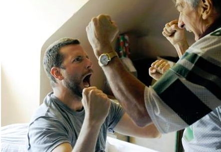
Saturday, March 6, 2021

Taking a look at movie posters

   As mentioned in my previous post, this week my blog postings have focused a lot on the visual aspects of my short film. For this post, I wanted to take a look at movie posters to garner some inspiration in the creation of the movie poster cards I have to make for this project! This post is just as much for me as it is for you, as this is mainly the research I have been doing to give myself ideas and I thought I should write out my thought processes here.


  Immediately when I was thinking about the visual aspects of the movie poster and short film in general that I wanted to achieve, I thought of the poster for the film Moonlight (2016) directed by Barry Jenkins. Everything down to the color scheme and this idea of threes are a similar concept to what my project will be presenting. Firstly, my color scheme is somewhat similar in the idea of blues and purples. What's also noticeable is that the image of the man is split into three parts, each part having a different color. In each part the man is a different age. In the first segment, it is a deep blue, and it is clearly a young boy. In the middle, a slightly older boy about early teens, is seen in a pink kind of purple. Finally in the last segment, an older man is shown in a more calm kind of blue.

  This shows what the movie is about in essence without even giving you the synopsis. It is coming of age movie about a Black boy becoming a man. The three different age ranges in the poster are also present in the film, and the poster highlights this by making each segment where the man is a different age, a different color. From the get go the poster already gives the audience an idea of what the film is about, and is such an artistically beautiful picture that draws them in and makes them curious to see what it's about even more. Additionally, this color scheme not only draws attention to the split image showing the three different phases of this man's life, but it shows the kind of color scheme that is consistent with the color scheme in the film. It matches well and that is also highly important.


  There were quite a few different posters for this film but I managed to find one with similar themes to Moonlight's poster. Even down to the font we see this theme of bold fonts and neon colors within them, which is something I'm now considering for my own posters because it really draws attention to both posters and goes well with the colors scheme. Again, it shows a portion of the main character's face with the blonde hair as in the title of the movie, and she has a serious expression so it communicates the idea to the audience that this is an action movie. 

  The title is also a play on words, atomic bomb with atomic blonde (another hint.) The color scheme in this poster, like Moonlight, is consistent with the color schemes in the movie. There is a consistent use of neon lights, and the colors blue, pink, purple, and some red. I'm not sure if this was intended, but throughout the film we see some bisexuality within the main character and in these scenes this color scheme of blue, pink, and purple are present. These also happen to be the colors of the bisexual pride flag. Regardless, the poster shares similar themes to that of Moonlight and both capture the visual themes that inspire the visual themes of my own. Both have heavy color symbolism and are consistent with the use of color in both the poster and the film itself.

Moodboards!!

   Hello! This blog post was especially fun to make because I wanted to dedicate it to moodboards. I really wanted to visually capture what kind of mood, aesthetic, tone, and even ideas for shots. So I made three individual mood boards to capture the three individual representations that will be taking place throughout my short film (previously mentioned in past blogs.) You'll notice that capturing the visual aspect and sharing them will be a common theme among these weeks blog postings. Since this posting is including moodboards, it will be a relatively short posting. I had a lot of fun making these and put careful thought into the kind of colors and images for each to fit perfectly together and to really capture what I envision!


Friday, March 5, 2021

Casting - My ideas for the characters

  Hello and welcome back to my blog! I've been thinking a lot about how many characters I want in my short film, and how to structure the cast so that it makes sense. Originally I was thinking of making one main character and any other characters that appear would just be background characters, or people that the main character only briefly interacts with throughout the short film. I'm still holding onto this idea, but then my teacher gave me another cool idea on how to go about this.

  Since I am personifying the symptoms and effects of a complicated mood disorder, it isn't going to be particularly easy. These symptoms aren't tangible objects you can describe, they are a set of thoughts, feelings, and emotions that deviate from the norm and drive certain behaviors that also deviate from the norm. So you can probably imagine that this is nothing like Disney's Inside Out, and my target audience isn't children. Not only that, but every individual with bipolar disorder experiences it differently, not to mention that there is more than one type of bipolar as it exists on a spectrum of sorts. Therefore it is important that I maintain as much accuracy as possible, but understand that while one may relate entirely, another might not relate much at all. My goal though is to mainly personify the basics about the disorder in a way that no matter how much somebody relates to it, they feel seen. This is where it might be hard to personify the disorder through just one person. This is where my teacher's idea comes into play.

  Instead of using one person for the one disorder, she suggested that I  could have different actors represent different parts of the disorder by having them all interact with the same events in the short film, but obviously their interactions would be different. This idea really inspired me with a multitude of ideas of how to go about this. I would have two, maybe three characters represent the different aspects of the disorder. Those main aspects being depression and mania, however the third may represent a mixed episode, a stable period, or a transitioning period between the episodes of depression and mania (I still haven't figured out which of those options the potential third person might represent, they may represent more than one.)

  One of the ways I could represent this ties directly to one of my previous blogs about color theory where I explain the colors I would use to convey the different episodes. I would achieve this through LED lighting as well as filters through the editing process. Another way is definitely through costume and makeup, which I will make an entirely separate blog posting about dedicated strictly to that topic in an upcoming blog posting!

Friday, February 26, 2021

Lighting techniques in film

   Lighting is another really important part of film. Like color, lighting also plays a large part in creating the ambiance of a scene, many times working together to create the majority of the tone. There are many different lighting techniques to discuss so lets dive into them!

  • Natural lighting - this one is very simple, it means exactly what it says. Natural lighting is the use of the lighting that is already available at the place you are shooting a scene for your film. Taking the time of day that a scene is taking place is very important on deciding the type of natural lighting you will be utilizing (for example night versus day.)
  • Key lighting - this technique is used to bring attention to an important subject of a scene, typically a subject or an actor.
  • High key lighting - uses white tones and bright lights, with minimal use of black or mid-range tones. Can be used to set an optimistic or hopeful tone.
  • Low key lighting - opposite to high key lighting, uses mainly dark tones and shadows and creates contrasting images. Usually used in noirs and thrillers because it does a really good job at creating an ominous energy.
  • Fill light - by using a backlight as well as a key light, fill lighting cancels out any shadows that would've been created by key lighting.
  • Three-point lighting - this is created by using a a key light, back light, and fill light. This is the most standard form of lighting that most productions use. This can control highlights and shadows depending on how you position each type of lighting, so it gives a lot of leverage for the cinematographer.
  • Backlight - this type of lighting hits the subject or actor from behind, and is usually placed higher than the subject it is lighting. They give more shape and depth and separate the background from the subject.
  • Hard lighting - this is a harsh lighting, created by a direct beam of light. It creates shadows and harsh lines, but can also create silhouettes and highlights.
  • Soft lighting - used to eliminate shadows, and can also be used as a fill light. It can give the illusion of coming from practical sources.

Wednesday, February 24, 2021

Color theory in film

  Color theory is an important part of film, and plays a big part in communicating the feeling of a scene to the audience. Not only does the color itself indicate a certain mood, but different hues of the color, the saturation of the color, and the brightness of the color can put make just one color mean entirely different things! A well known example of this is the use of the color blue. Blue can mean so many different things depending on its shade. Some blues are calm and peaceful, others mean sadness or depression. Sometimes some blues can be used to indicate professionalism depending on the hue. However, blue isn't the only example of this. Here are some other uses of different colors and what kind of context each can bring to a film:


  Another helpful resource in determining  all of the meanings different hues, saturations,  and brightness of just one color (let alone every color) can bring to a film and how you can use it to set the tone in your films was this video linked here: https://www.studiobinder.com/filmmaking-techniques-color-theory-in-film/                                          

  The use of color theory in my short film is going to be highly important. Because I am making a short film personifying bipolar disorder, setting the tone and the feeling is all the more important. I believe color will be one of the easier ways of doing this. Bipolar disorder is most simply put as a mood disorder in which manic and depressive episodes occur, and since I am bringing the disorder to life I immediately knew the type of color schemes I would love to utilize. I wanted to go with a red, blue and purple scheme. Red in this case would symbolize mania. This was a perfect choice because as you can see in the infographic, red increases physical energy, stamina, and spontaneity. These are all aspects of mania that red would symbolize perfectly. Blue in this case would symbolize depression, as mentioned previously depending on the tone of blue it can symbolize totally different things so getting the correct hue is super important here. Finally, purple will be used to symbolize either mixed episodes, in between states of red and blue, or the peace and harmony of a stable period (because people with the disorder aren't always experiencing a mood episode constantly, especially those getting treatment.) While purple doesn't usually mean this, I chose this color because when you mix red and blue you get purple. An in between state of the two. This ties in perfectly with a point the video makes, which is that you can make the colors of your film whatever you want them to mean, and with a good understanding of how to set the tone using color then this can be done well!


Saturday, February 20, 2021

How people with bipolar disorder are represented in the media

 Considering my last posting,  I only thought it would be appropriate to showcase my research on how people with bipolar disorder are represented in the media, or rather misrepresented in the media. I have done some research on this previously for a past assignment in this class, so it is fitting to include said research here.

Law and Order: SVU, episode 22 “Influence” season 7

This episode follows a teenage character named Jamie who is accused of murder after mowing down a group of people, one of which she killed, during a suicide attempt after being found for giving a false allegation of rape. In the episode, it is confirmed that Jamie has bipolar disorder and refuses to take her medication. This is a common trope that other crime shows/films and many other genres of tv and film follow, someone with mental illness (particularly bipolar disorder but other severe psychological disorders as well) refuses to take their medication and so is a loose canon and ends up committing a serious crime or crimes against others (the victims usually being neurotypical) as a result.


Silver Linings Playbook (2012)
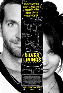

This film follows the main character, Pat, as he returns home after an eight month court ordered stay at a psychiatric facility after he beat up the man his wife was having an affair with. While this film does many things right in its portrayal of mental illness within a family and other supporting characters,  particularly with the main character Pat who is diagnosed with bipolar disorder, they also resorted to using the stereotypical trope of violence and aggression that is often used in the portrayal of any mental illness, but particularly bipolar disorder, in the media.


The contents of this meme is a part of a long running “joke” that those with bipolar disorder don’t actually have anything inherently wrong and that they’re actually just assholes using a label as an “excuse” to be one. It insinuates that anyone with bipolar disorder is automatically an awful person, lumping them together under a collective identity of being violent and abusive people, which stigmatizes the disorder and puts a false idea in those without the disorder’s heads about what a person with the disorder should look and act like.


Once again, another long running “joke” about bipolar disorder that implies that people with the disorder can’t seem to stick to a feeling,emotion, decision, or opinion. That they are always flipping from one extreme to another, one second they hate something and the next they love it or vice versa. This oversimplifies the disorder completely by creating a stereotype of the main symptom in the disorder which is severe mood swings. Not only is this an incorrect depiction of how this particular symptom manifests, but it oversimplifies the disorder by overlooking the fact that this disorder has a spectrum and a wide variety of symptoms that everyone with the disorder experiences differently. Oversimplification of the disorder undermines the severity of it and can be seen by misusing the term in our everyday language which additionally creates a stigma. Some examples being “the weather is so bipolar lately”, or “sorry I can’t go out tonight, my mom said I could yesterday but she changed her mind she’s so bipolar.”


Common representation tropes of bipolar disorder in the media include:

  • People with bipolar disorder are more likely to be criminals

  • People with bipolar disorder frequently refuse treatment

  • People with bipolar disorder are all hypersexual, unfaithful and have difficulty with long term relationships

  • People with bipolar disorder (as well as other psychological disorders) are all violent

  • People with bipolar disorder are all unable to maintain jobs and unable to experience successful careers


Thursday, February 18, 2021

First blog posting for my new project!!

   Hello! Wow, it's been awhile since I created a posting on this blog. I'm excited to share my journey with you on my newest project for this class. I have decided to go with the short film option for this project. Immediately I knew exactly what I wanted to create for this short film, and that was going with the topic of mental health. Mental health is an incredibly personal and important topic to me and it was important  to me to be able to depict it as accurately as possible in the form of a short film format. Unfortunately, there isn't a whole lot of accurate representation in the media on mental health, particularly the more severe disorders such as bipolar disorder, schizophrenia, personality disorders, e.t.c. Since bipolar disorder is one I don't see often and is a personal topic, I chose to focus on this disorder. 

  However, rather than focus on the person with the disorder solely, I want to personify the disorder. I was inspired to do this both by my teacher as well as a spoken word poem I began writing the other day that does just that, personify the disorder. My goal is that viewers would be able to get a deep dive into how struggling with the disorder actually feels. Often times we see it depicted in film as the behavior one with bipolar disorder exhibits, so it can be easily misrepresented and often leave room for stereotype and judgement. I want to convey the thought process and the emotions felt in an artistic way. With this method, I attempt to achieve a more empathetic approach to the conversation of mental health, and to expand it beyond just depression and anxiety. 

  I'm excited to share my progress in achieving this goal! I hope you are too!


Critical Reflection

    My short film, Reaching Equilibrium, is about a teenage girl named Evelyn who was recently diagnosed and starting treatment for bipolar ...